Chris Maple
Chris Maple is a Washington-based graphic designer known for creating the Western Pokémon logo, and the yellow-and-blue color scheme used for both it and the Japanese, Korean, Simplified Chinese, and Traditional Chinese logos of Pokémon Sword and Shield.
Work with Pokémon
In February 1998[1], while working at his company Media Design, Maple was informed by a friend to expect a call from then-president of Nintendo of America, Minoru Arakawa[2]. Arakawa invited Maple to visit the Nintendo of America headquarters in Redmond, revealing little other than that they were developing a new game and wanted him involved.
After meeting up with him in person, Arakawa told Maple that they were going to be launching Pokémon Red and Blue in the United States and Europe and needed a logo prepared for it. Maple accepted the job, and Arakawa's secretary presented an assortment of Pokémon merchandise to Maple and explained the basic concept of a Pocket Monster, which they would soon call a Pokémon. Arakawa informed Maple that he would only have a month to produce the logo; while usually companies would give several months to produce a logo, prior agencies they hired had not produced a logo that was up to Nintendo's standards, leaving them to turn to Maple last minute as the new logo needed to be ready for when Pokémon Red and Blue would be officially revealed at E3 that year.
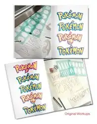
Maple quickly got to work, with the only materials given to him being an early version of Nintendo Power #108, and various toys and papers, including a figurine of Pikachu. The only instructions given to him by Arakawa were that the logo had to be versatile enough to work on the Game Boy's screen as well as print materials, Game Boy packaging, trading cards, and TV advertising. Additionally, the logo had to work in both black-and-white and color.
Maple designed several variations of the logo and presented them to Nintendo. They were seemingly unimpressed with all but one – Maple's favorite – which Don James, then-executive vice president of operations at Nintendo of America, affirmed was the logo they were looking for and instructed Maple to produce it. This would become the first version of the international Pokémon logo, which would debut in the finalized version of Nintendo Power #108 and appear at E3 later that year.
After E3, Arakawa approached Maple and asked him to make some minor adjustments to the logo. Maple obliged, producing the version of the logo that is used to this day.
Early logos
|
Trivia
- Maple believes that he may have been subconsciously thinking of Pokémon Blue and Pokémon Yellow when deciding on the yellow and blue color scheme for the logo, which he was told were planned for the West.
- When asked by IGN if there were anything he'd do differently if he designed the logo today, Maple admits that he'd wished he stuck with the original 1998 logo prior to Arakawa's request to make adjustments to it.